
The new look Campaign Brief Blog is now located at www.campaignbrief.com
THE CB BLOG IS SPONSORED BY
- Emerald City
- Sound Reservoir
- Absolutely Wild Visuals
- Campaign Brief Directory
- Tiger Sound
- Film Construction
- Best Ads on TV
- Postmodern
- Filmgraphics
- The Campaign Brief TVC Production Co. Directory - CLICK HERE
 Campaign Brief Blog
A blog for advertising creatives in Australia, New Zealand and Asia. To pass on news or advertise on the blog, or to subscribe to Campaign Brief Australia/NZ or CB Asia, or The Work 06 Annual, email: michael@campaignbrief.com
Pleural Mesothelioma
VISITORS SINCE DECEMBER 5, 2006


THE 2006 'BATTLE OF THE BLOGS' RUNNER-UP: BEST INTERNATIONAL AD COMMENTARY OUTSIDE THE U.S.
WHAT TIME IS IT AROUND THE WORLD?
- THE WORLD CLOCK
- DAVE JOHNSON DEPARTS THE PALACE
- SMART BIC PENS COMMERCIAL WINS 2006 GOLD SIREN
- EASTWOOD STARTS THE CREATIVE SHAKEUP AT DDB
- ASKING CONSUMERS TO DO COMMERCIALS BACKFIRES ON CHEVY
- $15,000 CASH PRIZE IN RELAUNCHED FOLIO AWARDS THIS...
- FRAME SET + MATCH INSTALLS THIRD FLAME TO MEET DEMAND
- CHANT CONFIRMED FOR FCB NEW YORK ECD GIG
- LEO BURNETT ELEVATES MARK TUTSSEL TO GLOBAL CHIEF ...
- PALACE MELBOURNE LURES EX MARKETFORCE PERTH TEAM
- MOJO AUCKLAND'S GLASSONS SPOT HELPS BREAST CANCER ...





Previous Posts
Friday, May 12, 2006


8 Comments:
Great. I laughed so hard I fell out of a tree.
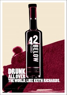
Funny. Looks good too. Cool art direction. I think they used the bood that leaked from the hole they drilled in his head to paint it.
Art direction looks quite boring to me.
yeah, red's boring and so done. All the cool guys are using blue.
2.10 Yeah you're right, every ad I've ever seen looks exactly like it.
For a product that is transparent in real life, it looks pretty dynamic.
2.10pm looks boring to me.
doesn't anyone remember neil french's campaign...drunk all over the world.
only me?
typical.
Don't remember it, I was drunk.
Post a Comment
<< Home