


BMF PUTS NEWSPAPERS BACK ON THE FRONT PAGE


BMF Sydney’s new campaign for The Newspaper Works aims to remind us that in today’s increasingly fragmented media marketplace, newspapers provide an incredibly powerful channel for advertisers to engage with consumers.
The campaign is aimed at advertisers, marketers, media buyers and planners, and dramatises newspapers’ core strength; unlike other media that are simply flicked through or passively consumed (often simultaneously), newspapers are the most engaging media of all.
We are reminded that newspapers are a destination, not a distraction. People who read newspapers are in the right mind space and actively seeking information, which is a perfect environment for advertising messages to stick.
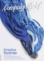
The campaign idea takes beautifully photographed everyday objects, and tells a compelling story around them. The reader is asked the question: if a newspaper can make something as ordinary as this so involving, imagine the story you as an advertiser could tell about your brand?
Several leading photographers were commissioned by BMF to bring the campaign to life and to ensure it depicted a best in class model for advertising in newspapers. It was shot at various locations around the world, including the US, UK and Australia. The Craft Shop was commissioned to complete the typography.
Tony Hale, CEO of The Newspaper Works stated; “We needed a campaign that demonstrates how newspapers can be used to capture readers’ minds, challenge conventional thinking and establish strong emotional connections. It was a difficult brief but BMF nailed it. They have delivered an exceptionally fresh and creative approach by tapping into the storytelling nature of newspapers.”
Warren Brown, BMF’s Executive Creative Director, commented: “Tony Hale gave BMF the creative freedom to do something special. I’m sure the campaign we created will go a long way to ignite some passion amongst clients for newspaper advertising.”
This Saturday, August 18th marks the start of a new story for newspapers with the launch of the campaign in Press, with five full-page executions. Over the coming months the campaign will show advertisers many ways in which they can harness the full power of newspapers to strengthen their brands.
Executive Creative Director: Warren Brown
Associate Creative Director: Simon Langley
Art Directors: Grant Booker/Simon Langley
Copywriters: Benn Sutton/Richard Morgan
Photographers: Max Forsythe, Michael Corridore and Toby Burrows
Typography: The Craft Shop (NZ)
Group Account Director: Nick Garrett
Account Director: Fleur Kennedy
Strategic Planner: Gerry Cyron
Client: Lucia Elliott/Tony Hale
posted by CB @ 7:16 PM
![]()
![]()
35 Comments:
“We needed a campaign that demonstrates how newspapers can be used to capture readers’ minds, challenge conventional thinking and establish strong emotional connections."
Everyone can learn from this. OK. So it's not OMG this is so fresh (They do remind me of the Glue society ads for newspapers years ago. Look and feel) But you just can't help but read them. These will be kick ass effective. If you are a client out there take not of that quote. Here's another. 'Great clients get great advertising" If you look at the majority of the effectiveness awards from the last few years you would have noticed that opening paragraph echoeing through the the very best of the best.
these ads are pretty cool. nicely written etc.
But I have one question.
Why is it that the newspaper is the only medium that has to advertise that it isn't shit?
the only medium that feels the need to remind us of its validity.
is it because it is no longer valid?
well if you read the previous posts, seems like radio needs to prove it ain't shit too.
Love the copy on snow dome.
we've got radio ads doing it too
the difference being they are crap
David, in the last couple of days the radio industry has launched a new 'we're not as shit as you think' campaign. Scroll down a little.
TV should be the one that is genuinely worried, however.
Because there's too many magazines out there print wise David. So the audiences are too fragmented. I think the thing that I do like about this campaign is that it encourages people to look at Newspaper ads as print. And THEY SHOULD BE. You have this great big page, do something with it. Use full colour and use great images. Instead of booking half pages in black and white.
Maybe a better idea would be for the paper to run the best magazine ad of each month for the same price that it ran in the magazine. Assemble a panel of judges etc. Get people to enter their print ads online blah blah blah. We need to be finding away to encourage that crossover. To get newspaper advertising to look like print rather than black and white retail city. Just a thought. You can pay a fee into my annonymous bank account.
At last! Intelligent, amusing ads for the intelligent people who take their newspapers seriously.
Well done!
Love the fact there's no logo!
Newspapers no longer valid? There's a statement? What, no one buys them? No one reads them? Gosh, that Rupert Murdoch chap must be a real sucker - he buys a different one just about every day.
Think it's a top campaign. Love the fish story!
What I love about newspapers are their immediacy, the brutality of a sub-editors headline. the 3 word headline that says it all.
I love the fact that newspapers have a life cycle of 24 hours, then they're thrown away to make way for tomorrows news. It's a tough life being a newspaper. This campaign, whilst beautifully shot and written, is not enough to get my clients to re-consider newspapers. It doesn't reflect the reality of newspapers. Nor does it scream NOW! Maybe a campaign for the Weekend Magazines, but not the daily newspaper. Sorry.
Love the photography. Love the first 2 thirds of the copy. Then felt completely let down by the clunky segue into the newspaper stuff. Maybe a logo and a line would have been more effective.
At least it wasn't nearly as clunky as the horrible bundy bear in the ad a little bit further down the blog.
ads are ok, another overly long bullshit PR spiel to go with them though, that could have all been expressed in one sentence. I hate it when the PR bollocks explains the ad, wasn't that the first thing you learnt at ward, if you have to explain the ad it doesn't work.
TV IS doing it - using harvey norman and telstra as case studies (www.thinktv.com.au) . All traditional media seem to be a bit worried. This campaign is the nicest so far.....
These ads have great art direction, but are let down by copy that isn't quite as good as it needs to be. Or as readable as it should be, from a typographical angle.
If you go down this path, you'd better be as good as David Ogilvy or Neil French. And unfortunately, the writers of these ads aren't.
Ten out of ten for ambition, seven out of ten for ability.
Sorry, I just dont buy it. The strategy or execution. Newspapers are disposable. A quick daily hit to fill up on the news. You flick through it over breakfast or on train. Editors put headlines in to capture your attention and hook you. Theses ads will be read by ad people admiring the fact the makers had the balls not to use a headline. And maybe award judges. This campaign would have been better suited to magazines. That is where people invest the time to sit down and read and absorb large amounts of information. Newspapers are a quick fix. You blag on about your product for too long or make it look too hard to get into and the reader will turn the page, casue he has 5 minutes to read the footy results, and how many people the latest car bomb in Baghdad killed. Shouldn't the campaign have reflected this instead of turning it into the chance for the copywriters to try out some of the stuff they might get to put in their movel or manuscript one day? Pretty pictures. But again they would lok much cooler in print where they would also have a much longer shelf life. Still at least the agency got to do ads that A. Dont have headlines & B. Dont have a logo. Crazy.
I'm with 9:53
Unfortunately, most advertisers and what they want to say about their products aren't more interesting.
9.53. You obviously haven't got a clue about this game.
I'm with 10:01.
I'm with 9:53
It's not about writing movels (sic) 9.53. It's about writing ads. Which they've done brilliantly.
I'm with 10.01 AND 9.53.
Let's be frank - would a newspaper run an article without a headline? Then why would we think ads about newspapers that don't have headlines would be read? However, if it's being read by ad wankers (like us) as suggested by 9.53, then it's probably reaching a pretty important market. Christ, if it makes one young writer realise that an ad can have more than ten words of body copy, it's done well.
Fairenough 5pm
So it is a brilliant campaign aimed at copywriters to encourage them to write long body copy......
andthe newspaper people got tricked into paying for it.
10.01 is is 9.53 here
I am waiting to quench my thirst from your pool of knowlwdge. Why dont you hydrate me in 200 words or less.
5pm
the brief was to promote the advantages of newspaper advertising. Not long copy ads (which are better suited to print). Where is the unique point of difference for newspapers? Shouldn't the ads have promoted that?
As for the target market surely the advertisers and media people are the ket. Creatives have stuff all say in the media their client choose.
this campaign breaks all the rules.
it works on the entirely new principle that 'you've got 3 minutes to grab them before you lose them'.
Love the photography - really beautiful
they look beautiful but the only opening line that made me want to keep reading was the cushion one.
The problem here is that you could use TV, magazines, radio, DM to tell an interesting back-story about a shoe left at the opera. I wanted to like these, but they leave me feeling no better about newspapers than I did going in.
Good effort, but pretty ineffectual.
Just seen them in the papers. They look HUGE.
Sorry,they strive to be interesting but fail.....
To be honest i've seen them alot in the papers this week and genuinely didn't feel engaged enough to read them. Considering the campaign is about story telling, the imagery is very dissappointing....adding a few well known photographers names around,doesn't alter that fact.
Sorry guys. Neil French got it right and you didn't. All this does is prepare people for those crappy short story competitions newspapers run over the summer hols to fill in space.
Post a Comment
<< Home