


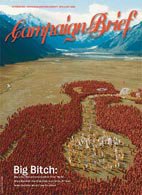


WALKING FINGERS DO THE WORK FOR YELLOW IN NEW ZEALAND
Over in New Zeraland, Yellow wanted people to reappraise their brand but maintain some of the equity they'd built up over so many years. Probably the best known thing about Yellow is the walking fingers logo, so the creatives at Saatchi & Saatchi Auckland turned the hands into helpful little critters who do the finding for you.
Product: Yellow Brand
Title: Party
Client: Yellow Pages Group
Agency: Saatchi & Saatchi, Auckland
ECD: Mike O'Sullivan
Creative Group Head: Rob Beamish
Creative Group Head: Hilary Badger
Agency Producer: Jane Mill
Director: Mark Molloy
Producer: Wilf Sweetland
Production Company: Exit Films
Cinematographer: Greig Fraser
Animation: Animal Logic
Music: Bathtime in Clerkenwell by The Real Tuesday Weld
posted by CB @ 10:27 AM
![]()
![]()
15 Comments:
Not bad, not bad at all.
Ho hum.
A 'coming together' cliche that even has the main character saying it.
Still, twice as good as the YP stuff out of Oz.
But what's two times zero?
I know...
If we rip off the tongue ad but significantly increase the number of appendages, everyone will think it's original.
(I must confess that the hands look good, though).
Most hated ad in our office this year. Hands down.
Very memorable branding in a weird and wonderful way. Love it!
let your fingers do the walking.
the yellow pages campaign from the 80s revamped.
but a nice revamp.
Forget about ripping the tongue ad, The Adam's family did this gag 4 decades ago.
Really dumb music too.
I bet the agency would've expected mostly positive comments about this ad. And if it was done seven years ago, no make that 25 years ago they probably would've got them.
I fuckin hate spiders, they scare me shitless.
I didn't see hands - I saw a legion of mutant black fleshy spiders the size of a large hand, scuttling all over the screen.
so I spent the entirety of this ad cowering under the desk, afraid to look at the screen.
don't think I'll be able to touch a yellow pages after this.
Formula. Lots of 'things', moving, to a quirky track. seen it a million tims.
i really like the ad, Yes it's a bit like the tongue ad but the tongue ad was also a lot like "Detachable Penis" by King Missile where a penis went off having a good time without its owner. Nothing is truly original. (except for the macenroe mars ad - no one else has done a stinker quite like this although it does smell like something i expelled from my body this morning).
Bit of a wank, well a handjob anyway
I kinda like it, but I also find it kinda creepy.
I know the fingers in the logo are black, but I still thik the hands should've been yellow in the ad - would've reflected the brand better and been less evil looking.
Smart to bring back the old "let your fingers do the walking' idea though.
I don't see how the hands could have been yellow and still jump into the logo at the end. Still, those black hands are a bit scary/spidery. Maybe they could have been a bit more delicate-looking... dunno.
Would work better online.
Just have that last bit in there.
Post a Comment
<< Home